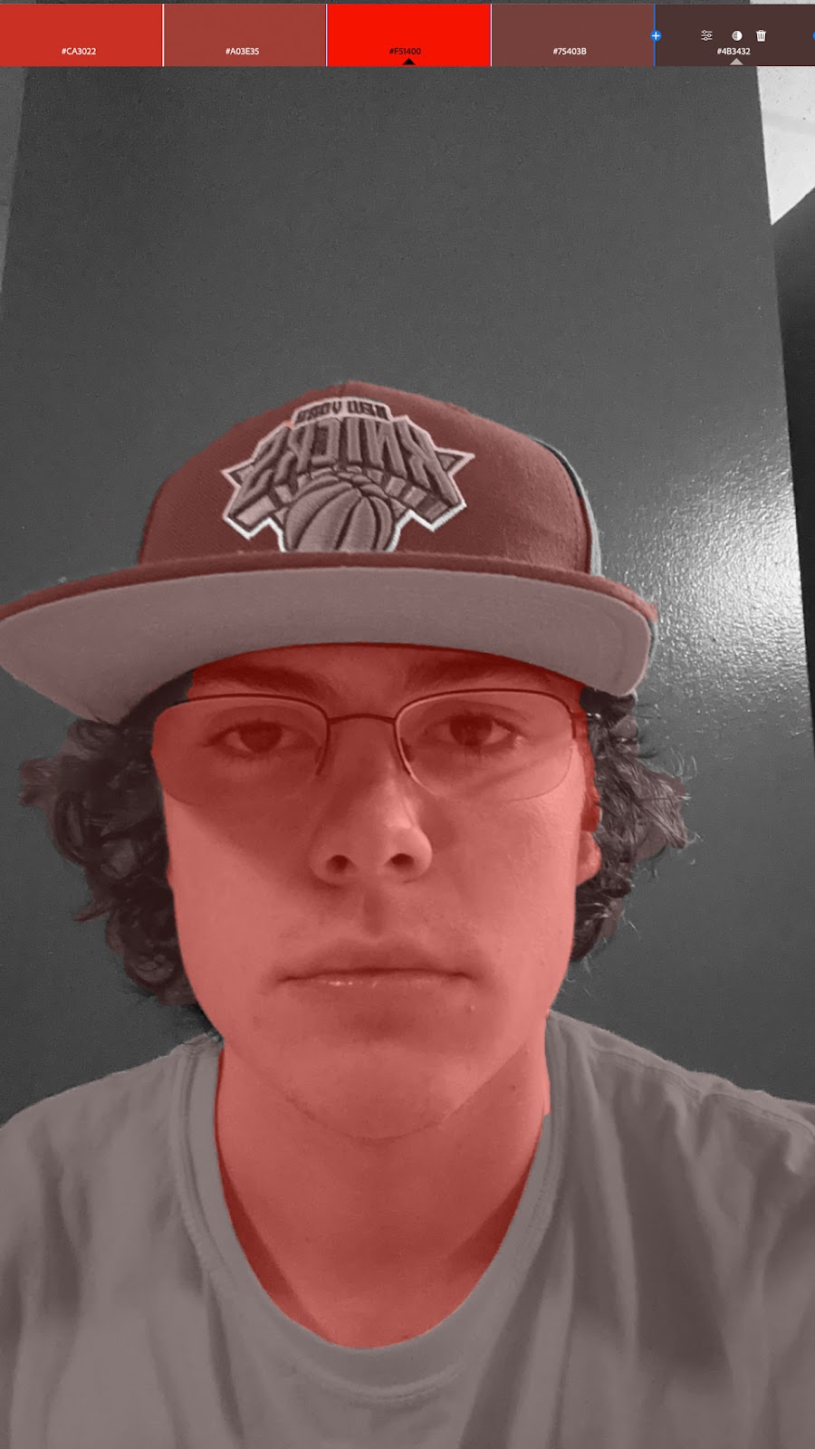
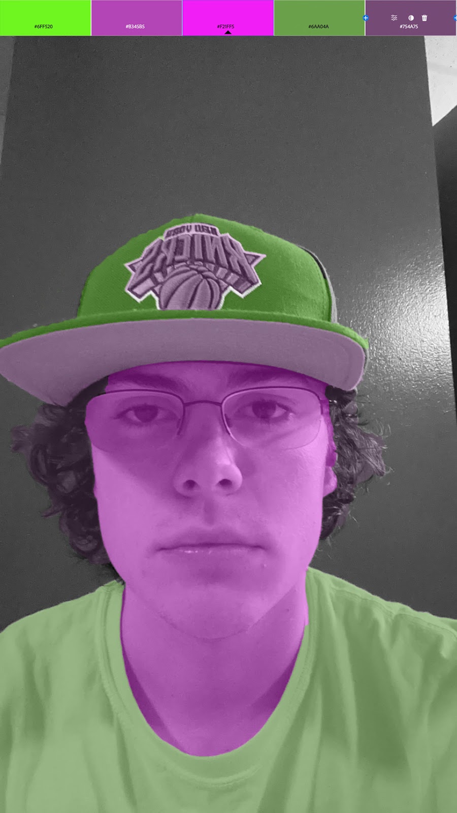
I chose this picture because I felt like it was a good basic image of me to edit. I chose the colors based on the Adobe color website and tried to find color schemes that were aesthetically pleasing to me.
Artist Statement: I utilized a template created by Sirisako, here is a link to it: https://www.unsell.design/free-indesign/free-blue-interior-portfolio-indesign-template/ I wanted to go for a simplistic design for my portfolio to put an emphasis on the pieces I present. I have an artist statement and sketches/work-in-progress images to give the viewer a better sense of my creative process.
I think that InDesign won't be too hard to learn since we have been using Adobe programs all semester and they work in somewhat similar ways. The pages feature seemed like it was a little bit confusing but I more or less understand how it works after watching the video Some of the tools seemed really intuitive, like the frame tool. I liked seeing how that feature works and I feel like it will definitely be useful. Overall, nothing in this tutorial seemed too difficult to grasp and I feel like I am comfortable enough with Adobe products to be able to pick it up quickly. This is a video by the same person as the previous one and I really like how he teaches the program. The skills showcased in this video are definitely more advanced than the previous one, but also were explained in an easy to digest way. The most interesting part of this video was him discussing how to format the text to look good and also he delved into some text effects which made the design really pop. Overall t...
I chose this scene because it is a funny scene from a movie I liked. Also, my wardrobe is fitting with the character who is in this scene so I felt like it would be a good fit.


Comments
Post a Comment